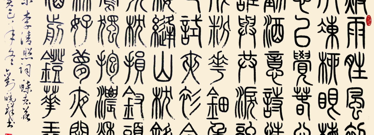
The story of Modern Chinese Fonts
In February last year, we reviewed a well-researched and engaging book about the development of modern Chinese characters. Kingdom of Characters explored how China’s centuries-old script was adapted with difficulty to the modern world. Earlier this month, an article in I-Feng explained how the characters became fonts usable on all modern keyboards.
Standard printed Chinese characters appear when you use a Chinese keyboard on a computer or mobile phone or read a book. However, these ordinary fonts took much work to develop. After the founding of the PRC, to solve the chaos of Chinese character fonts in China, the font designers of the Shanghai Institute of Printing Technology designed the fonts to print commonly used Chinese characters.
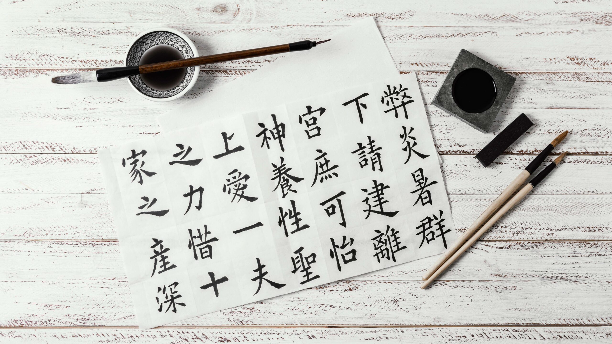
Chinese characters are the oldest characters still used in the world. They are the artistic crystallisation of the development of Chinese civilisation. Nowadays, the standardised printed fonts we see on computers, mobile phones and books come from font designers and their skills.
In the early days of the PRC, China's Chinese character fonts and glyphs were messy, and the mixed-use of allomorphs and local variants seriously affected the quality of printing and reading. This led to the failure of China's participation in the International Book Binding Expo. In 1956 the Shanghai Institute of Printing Technology was established and became the birthplace of modern Chinese character printing fonts. In 1959, the Ministry of Culture held a meeting to invite Shanghai to take the lead in carrying out the "printing font reform". The printing institute gathered talented people with artistic creativity in Shanghai. They needed good writing and experience in engraving. They set up a font research room composed of more than 50 people. As a result, the profession of font designer emerged in China.
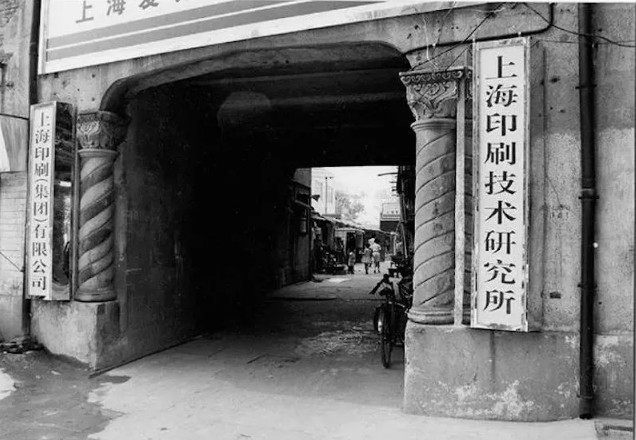
It took five years for the designers of the Font Research Institute to develop a complete set of skills and complete the creation and design of the four commonly used printed fonts of Song, Black, Regular, and Imitation, with a total of 80,000 words. This significantly contributed to promoting Simplified Characters and standardising Chinese characters in the PRC. These fonts are used until now, pivotal in the new Chinese culture's popularisation, inheritance, and development.
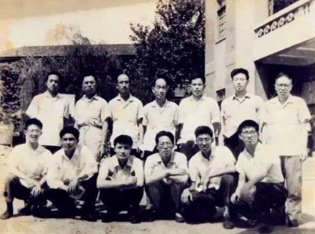
In 1969, the font design room of the Shanghai Institute of Printing Technology took a group photo.
The design of fonts needs to go through five processes. The first is the lead design. The designer uses a pencil to outline the character on a special manuscript paper, which is the key to the success or failure of a font. The second step is to draw a line and use a ruler to draw a black line which requires that the ink colour is uniform and consistent, and the lines are smooth. The third step is to sketch and use a tracing of the designed glyph outline. The fourth step is to fill the black ink colour with the white part in the sketch. The last step is trimming, refining, and applying burrs with white paint to make the lines and pen shapes smooth and beautiful.
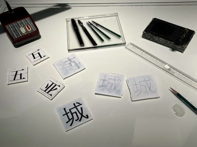
Font design steps displayed in China's Modern Press and Publication Museum.
A well-known designer, Jiang Qing, believes that the development of modern printed fonts in China can be divided into 200 years. "The first hundred years were from 1860 to 1960, that is, after the relocation of Meihua Library from Ningbo to Shanghai. Then a series of word model technologies were applied and promoted, including electroplating and the technological development of engraving machines and ordinary light source phototypesetting. The next hundred years can continue the Chinese printing improvements of the Shanghai Institute of Printing and Research to the computer font library and mobile font.
In addition, "Song Qiti" will be the first Chinese font to enter the metaverse and contain a digital collection.
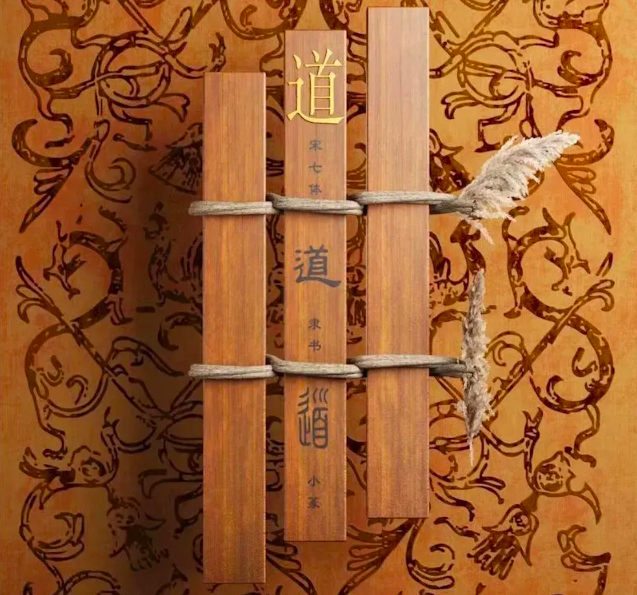
Song Qiti Digital Copyright Collection
Worked on the article:

Wanlikhang


